
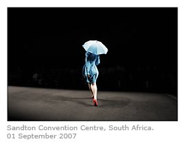
 Again, an image blogged before. I was asked if it was shot in a theatre and replied: "Fashion show... so yeah, theatre."
I am not good with colour... there was something about this woman that always reminded me of the central figure in Seurat's A Sunday Afternoon on the Island of La Grande Jatte, though that figure's parasol is red, not blue. I have said before that I am partially colour-blind, that I have trouble distinguishing between certain "cooler" colours; this since an accident in primary school which also had me switch the colours red and green for a few moments, before passing out completely.
One of the bonuses of modern digital equipment, is that it allows the photographer to shoot in black and white, while the RAW image still retains all the basic colour information... more on this later in reference to Alec Soth's realisations during the preparation of Dog Days Bogota.
Another aspect of modern photography: digital noise. I have never tried to compensate for the grain in this image... it was shot under difficult conditions, with the model's turn so sharp her foot blurs even at 1/125th of a second. Lights pick up behind her... whether reflection, or watches, or compact cameras, I am not sure... it may well be extreme digital noise. Zander and I have at times compared this to a "painterly" effect, perhaps the essence of Pointillism?
"Pointillism is analogous to the four-color CMYK printing process used by some colour printers and large presses, and to a lesser degree to computer monitors and television sets which use tiny dots of primary red, green, and blue to render colour."
 La Grande Jatte was the first painting I ever looked at "in-depth", while still a child, as a result of a pop-culutre upbringing. In the 1986 film Ferris Bueller's Day Off, the character Cameron is shown staring at the little girl holding the hand of the woman with the parasol. The shots cut from his face to that of the girl, moving in closer each time, until eventually the texture of the canvas is visible, and her face is rendered in its most basic elements, with no specific form.
 Shot in the Chicago Institute of Art, the director John Hughes describes the the painting...
"... like making a movie, in point of style. You don't have any idea of what you've made, until you step back from it. I used it in this context to see... the closer he looks, the less he sees, with this style of painting. The more he looks at it, there's nothing there. He fears that the more you look at him, the less you see, there isn't anything there. That's him."
 Seurat himself was almost scientific in his analysis of his work and in the last years of his life "turned his attention to trying to devise a rational approach to the emotional aspects of colour", according to Jon Thompson in How to Read a Modern Painting. La Jatte is described as a "classical painting in Impressionist guise", a feature of his colour theories based on the reading of Michel-Eugene Chevreul's The Principles of Harmony and Contrast of Colours. Chevreaul's theories lie at the heart of Seurat's Pointilism, particularly in La Jatte...
"Harmony is a correspondence between conflicting and similar elements of tone, of colour and of line, conditioned by the dominant [colour] key and under the influence of a particular light, in gay, calm, or sad combinations" - Georges Seurat


No comments:
Post a Comment